Get in touch
555-555-5555
mymail@mailservice.com
MICHAEL HO
UPS Healthcare
Redefining the possibilities
Overview
Develop a 10 year innovation strategy for UPS Healthcare to improve its positioning and offering in the medical related logistics.
Our goal with this concept project is explore digital creation and sharing features to bridge the gap between Moleskine’s Smart Writing System and the needs of a modern content creator, while still embracing the brand’s heritage of literary and visual creativity.
Duration
2 Weeks
Catthy Nguyen, Michael Ho, Rebecca Sokol
UX Researcher/UX Designer
Team
Role
New The existing Smart Writing System solves a problem in itself, but another problem arises.
The Smart Writing System is based on a Smart Pen accompanied by a standalone mobile application. It allows users to have their physical notebook content available in digital format. The problem is that this limits users' content creation capabilities to a specific device, the Smart Pen. This is a commonality observed across Moleskine’s competitors.
Overview
Organ transplantation is becoming an increasingly demanded and critical medical procedure in the recent years, naturally increasing the need for donor organs and the facilitation from its donor to recipient. In 2022 alone, 48,200 organ transplants were performed, setting another annual record.
The system that supports the complex process of organ transplants that happen across the U.S. is restricted to
Even though organ transplantations are a lifesaving procedure for many, people are having to wait for an organ for transplantation for as long as 5 years. Organs are low. However, the inefficient system that delivers organs make it even slower and wastes precious organs that otherwise could have been received by a needing patient.
The number of successful procedures also depends a lot on the existing system and infrastructure that facilitates such complex process.
This is an area for UPS Healthcare to become a leader
Key problems
- Limited geographical reach
- Lack of accountability in the delivery chain
Assessing UPS & UPS Healthcare's existing infrastructure
A unique opportunity for UPS Healthcare to become a leading innovator in organ transportation. The strategy involves technology, infrastructure and system changes.
Turning our focus to other players in the notebook space, we discovered the aspects that competitors have both done well and under-delivered; further identifying the gaps that our design can fill. We put together a feature inventory that compared multiple competitors’ product offering.

Although all the competitors’ products are geared towards notebook digitization, most of them restricted the way users interacted with the product. Rocketbook limits users to a specific notebook and recommended pen, while users of Remarkable can only take notes through a specific device.
A look at the marketplace
Define
Who are the users?
To answer this question, we draw from research findings. A user persona was created to help set the design direction through informed user behaviors, challenges and preferences.

Problem Statement
Tom needs a way to create, organize, and share content so that he can effectively connect and collaborate with friends and other content creators.
The problem statement highlights three challenges – creating, organizing and sharing content – influencing the quality of engagement between users. The set of challenges presented here require the solving of one, before the following can be attempted.
The existing Smart Writing System solves a problem in itself, but another problem arises.
The Smart Writing System is based on a Smart Pen accompanied by a standalone mobile application. It allows users to have their physical notebook content available in digital format. The problem is that this limits users' content creation capabilities to a specific device, the Smart Pen. This is a commonality observed across Moleskine’s competitors.
But why not create a more inclusive environment that provides users multiple ways to satisfy their creative needs?
Users expressed that they would like to organize their notes and illustrations but the organization function with their current tool either has limitations or is confusing to use. It is integral to design a functional and usable system to keep users’ content organized, as an effective design at this stage of the user flow determines how easily users can later share their content.
If content creation is the soul, content organization is the brain.
The existing Moleskine mobile app acts as a way to transfer and store physical notebook content to the user’s mobile phone. However, this system lacks a direct channel for users to easily share their work or view others’. In essence, users are given an incomplete experience and are faced with a dead end.
A miss is as good as a mile: an incomplete experience.
Create
Organize
Share
We generated a user flow to outline and segment the stages of a user’s experience as they create and share content.
Ideate

User Flow

Information Architecture
We looked into the potential information architecture of the mobile application. The outline of the sitemap helped inform the priority and choice of the navigation tab bar elements later on.


With the problem expanded and user flow outlined, the first design challenge to tackle was how users could
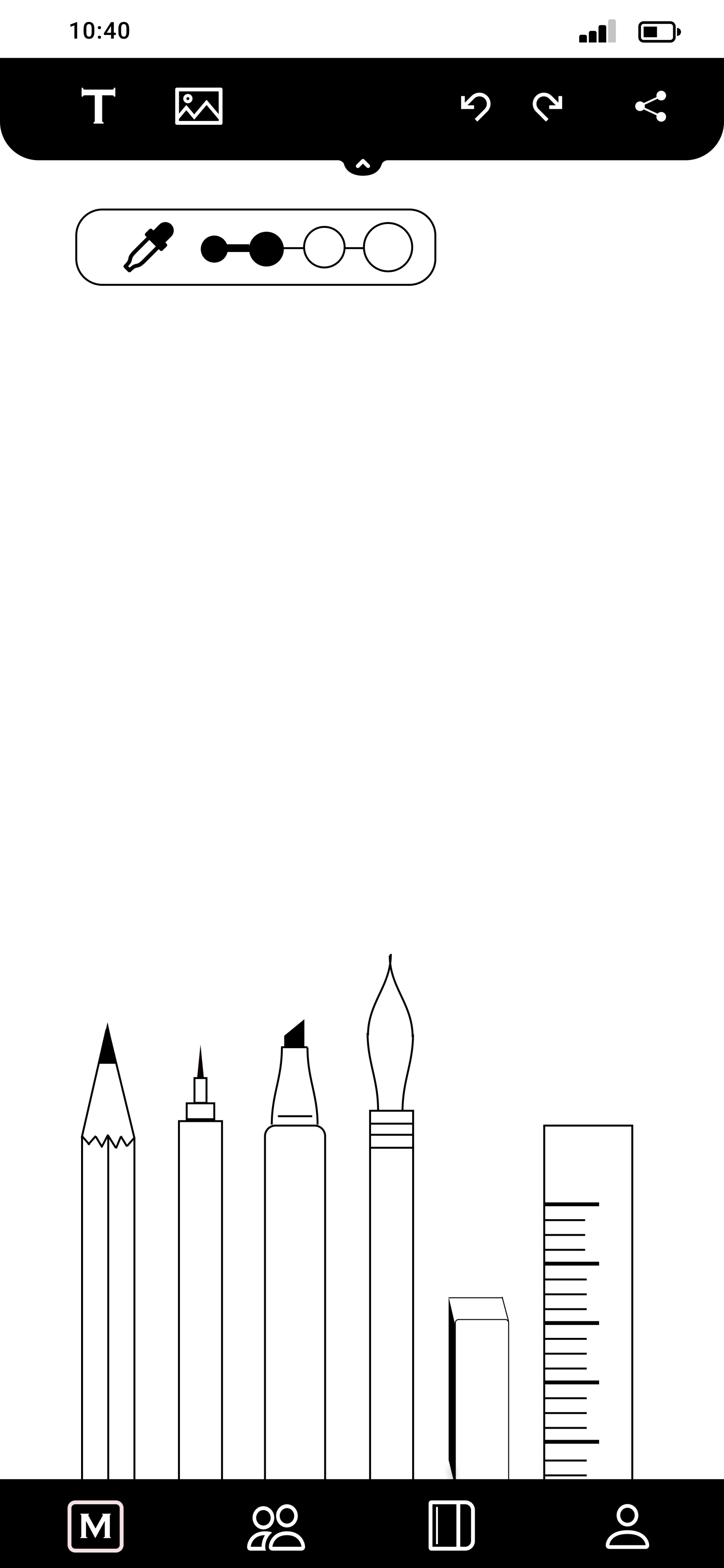
create content. By combining a digital canvas for users to put down their ideas and the existing Smart Pen import function, we open up more avenues for users to express themselves.
Mid-Fidelity Wireframes
Research findings indicate that users want the ability to view and arrange their content. This comes as no surprise, as it is understandable that users in the creative space favor visual approaches. As such, the visual aspect forms the foundation to good
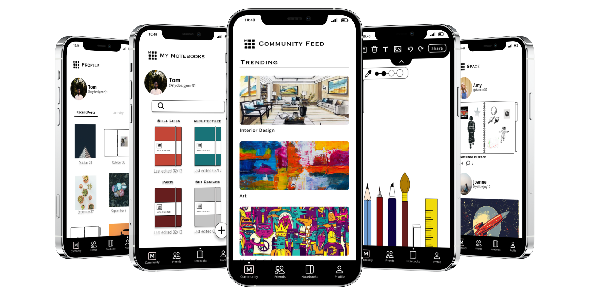
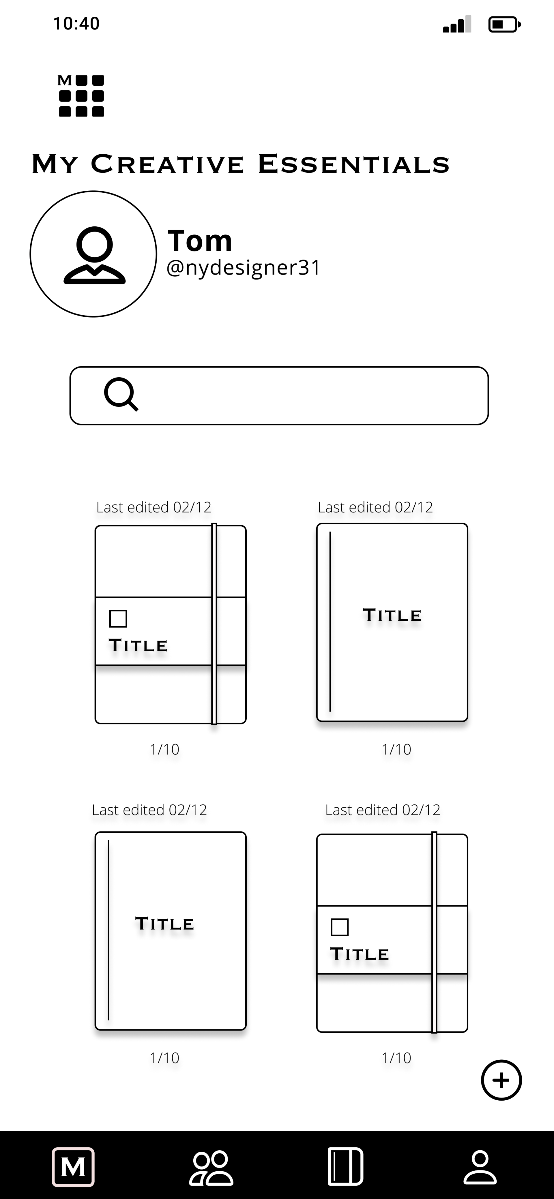
organization. The design of the Notebook screen incorporates a grid format to display a user’s set of notebooks. Each notebook can be assigned a specific color and title in the setup. The design is made to resemble the look of Moleskine’s iconic notebook, further building on Moleskine's brand image and embracing its heritage. A search tool is also made available to aid users’ search for their exact notebook or page.
A part of effective user connection and collaboration depends on whether users feel comfortable
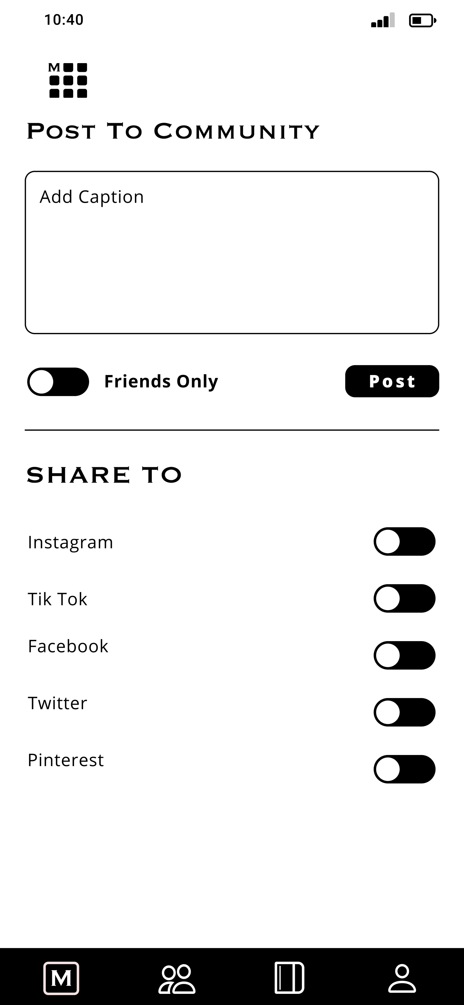
sharing their content. Our research points out that some people find it difficult to
share through social media, fearing unwarranted judgement. Guaranteeing a friendly online environment is a difficult challenge to overcome in its entirety. However, giving users an option to share their content within a select network of people, may help mitigate the uneasiness of users engaging in a social network.
Iterate
Results and feedback from the first round of usability testing confirmed some of our design decisions. However, there were several information and usability issues to address in the next iteration.
“My Creative Essentials”, coined by Moleskine, was originally chosen as a title for the Notebook page to better align with the Moleskine brand. However, testing results showed that this confused users due to the ambiguity. We replaced the title with a more direct term, “Notebooks”.
There were also visibility issues that needed to be resolved.
Users found it difficult to perform the task of adding a new notebook.
Users struggled to access the slide down toolbar in the canvas page.
Users had trouble sharing the content created.
Users had trouble knowing their location in the mobile application
Increasing the size of buttons and icons allow for better visibility. Instead of using an icon as the share button, using the direct term “Share” as the button improves the discoverability of the feature.
Introducing labels and a location indicator to the navigation tab bar alleviates the confusion and robustifies the established information hierarchy.


High Fidelity Wireframes
Next Steps
The second round of usability testing brought up further areas of refinement.
As we tackled the way notebooks are organized, it seems as though the organization of pages within a notebook need some rethinking as the way users navigated through and created pages was observed to be difficult. Implementing Fitts’ Law of space and distance into the design can positively impact the user’s experience here.
I want to also explore more ways to enhance the features of the social network, such as including a messaging feature to enable users to connect and collaborate beyond the predefined spaces.
All Rights Reserved | Michael Ho
Privacy & Terms